Learner diary
Learner diary week one: D.I.S.T.I.N.C.T.


We analysed a poster and picked out key it's feachers.
Learner diary week two:
- Brief (what is a media brief?)
- Client (who or what is a client? who is the client for the brief you have been given?)
- Audience engagement (what is meant by this term?)
Brief: Is how you as a client outline your advertising media objectives, target audience(s), budget and other criteria to
Client: A person or group that uses the professional advice or services of a lawyer, accountant, advertising agency, architect, etc. a person who is receiving the benefits, services, etc., of a social welfare agency, a government bureau, etc. anyone under the patronage of another; a dependent.
My client is east Norfolk sixth form college and is asking for help further promote the collage to potential students.
Audience: People or market segment at whom an advertising message or campaign is aimed at.
Learner diary week three:
- Primary and secondary audience (what does each term mean?)
- Demographics (what is it / what does this include?)
- Brand identity (what is it / what does this include?)
Primary audience: Are the main target audience who will receive the communication directly. When a business is developing an advertising agency it is pretty much necessary that the focus is on the customer behavior, needs and characteristics of the product.
Secondary audience: Are the groups of people who are not likely to buy use your product but can exert an influence on your primary audience & play an important role in their buying decision.
Demographics: Are Measurable characteristics of media consumers such as age, gender, race, education and income level.
Brand identity: Is how that business wants to be perceived by consumers. The components of the brand (name, logo, tone, tagline, typeface) are created by the business to reflect the value the company is trying to bring to the market and to appeal to its customers
Learner diary week four:
- Typography (identify 5 terms covered and say what they mean?)
- Hex codes (what are they and why are they used?)
- Web page layouts (state the 3 that you identified in your research and add the images of the box layouts)
Typography: Is the art and technique of arranging type to make written language legible, readable, and appealing when displayed.
Font family: Is a set of one or more fonts each composed of glyph that share common design features.
Web safe fonts: are fonts likely to be present on a wide range of computer systems, and used by Web content authors to increase the likelihood that content displays in their chosen font.
HTML & C.S.S.: HTML (Hyper Text Markup Language) gives content structure and meaning by defining that content as, for example, headings, paragraphs, or images. C.S.S. (Cascading Style Sheets) is a presentation language created to style the appearance of content—using, for example, fonts or colors.
Serif and sans serif: A small decorative line added as embellishment to the basic form of a character. Typefaces are often described as being serif or sans serif (without serifs). The most common serif typeface is Times Roman. A common sans serif typeface is Helvetica.
Monospace: A monospaced font, also called a fixed-pitch, fixed-width, or non-proportional font, is a font whose letters and characters each occupy the same amount of horizontal space.
Hex codes: A hex triplet is a six-digit, three-byte hexadecimal number used in HTML, C.S.S, S.V.G, and other computing applications to represent colors. The bytes represent the red, green and blue components of the color. One byte represents a number in the range 00 to FF (in hexadecimal notation), or 0 to 255 in decimal notation.
Web page layouts:
Photoshop templates:
I made this template in Photoshop and saved it as a P.N.G (Portable Network Graphics) because it enabled me to save it without a background. I used this template to guide me on the placement of text and images on the website I was creating for the East Norfolk sixth form college.
Hyperlinked PowerPoint:
I made this in PowerPoint with the help of the template I made in Photoshop, and when I finished placing the objects I made a hyperlink which when you clicked on it you go to the other page.


Font family: Is a set of one or more fonts each composed of glyph that share common design features.
Web safe fonts: are fonts likely to be present on a wide range of computer systems, and used by Web content authors to increase the likelihood that content displays in their chosen font.
HTML & C.S.S.: HTML (Hyper Text Markup Language) gives content structure and meaning by defining that content as, for example, headings, paragraphs, or images. C.S.S. (Cascading Style Sheets) is a presentation language created to style the appearance of content—using, for example, fonts or colors.
Serif and sans serif: A small decorative line added as embellishment to the basic form of a character. Typefaces are often described as being serif or sans serif (without serifs). The most common serif typeface is Times Roman. A common sans serif typeface is Helvetica.
Monospace: A monospaced font, also called a fixed-pitch, fixed-width, or non-proportional font, is a font whose letters and characters each occupy the same amount of horizontal space.
Hex codes: A hex triplet is a six-digit, three-byte hexadecimal number used in HTML, C.S.S, S.V.G, and other computing applications to represent colors. The bytes represent the red, green and blue components of the color. One byte represents a number in the range 00 to FF (in hexadecimal notation), or 0 to 255 in decimal notation.
Web page layouts:
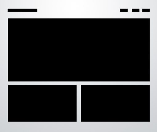 |
| Three boxes: This is probably the most simple layout on the list. In fact, you’ll be tempted to think that it’s far too simple to ever fit your own needs. If this is the case, you’ll be surprised if you really put some thought into how versatile the arrangement really is. |
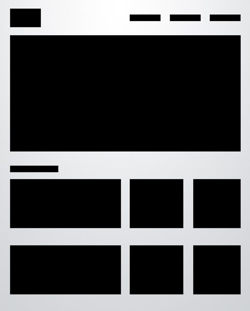 |
| Advanced grid: As with the three boxes example, there’s one primary graphic heading up the page. This is followed by a simple twist on the idea of a uniform grid of thumbnails. The space would allow for a span of four squares horizontally, but instead we’ve combined the first two areas so that the left half of the page differs from the right. |
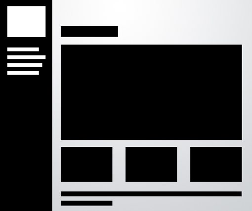 |
| Fixed sidebar: The other popular option is of course a vertical navigation, which lends itself to creating a strong vertical column on the left side of the page. Often this is a fixed element that stays where it is while the rest of the page scrolls. The reason for this is so the navigation can stay easily accessible from any point in the site.
Lerner diary week five to seven:
- Mood Boards (what are they used for and why did you make one?)
- Photoshop templates (how and why did you make one?)
- Hyperlinked PowerPoint mock-up of webpages (how and why did you make them?)
Mood board: A mood board is a type of collage consisting of images, text, and samples of objects in a composition. It can be based upon a set topic or can be any material chosen at random. But in this case this mood board is for the East Norfolk sixth form college. And I chose these pictures because they show equality, kindness and a place to learn.
 |
I made this template in Photoshop and saved it as a P.N.G (Portable Network Graphics) because it enabled me to save it without a background. I used this template to guide me on the placement of text and images on the website I was creating for the East Norfolk sixth form college.
 |
Hyperlinked PowerPoint:
I made this in PowerPoint with the help of the template I made in Photoshop, and when I finished placing the objects I made a hyperlink which when you clicked on it you go to the other page.


Comments
Post a Comment